The logo is the central element in the presentation of the brand. Striking and with a high recognition factor, it reflects the identity of the company. The design principle hinges on the trademark and its positioning.
Know the difference:
Logo
A logomark or logo from Ancient Greek λόγος (lógos) ‚word, speech‘ and τύπος (túpos) ‚mark, imprint‘) is a graphic mark, emblem, or symbol used to aid and promote public identification and recognition. It’s the trademark and visual representation of the brand.
Icon
An Icon (also pictogramme, pictograph, or simply picto) is a graphical symbol that conveys meaning through its visual resemblance to a physical object. It’s used in communication to visualize and represent processes, products, services, items or even abstract terms.
Visual
A visual is the primary image for advertising materials such as posters, billboards and online banners, and communicates the core message of the campaign. Repeated usage in different communication channels results in higher recognition.
A common logo as a unifying element
The Koenig & Bauer wordmark is the trademark for the entire Koenig & Bauer Group and serves as an all-encompassing signature for all business units and companies. the powerful and elegantly formed wordmark underscores the identity of the company.
You can download the trademark in a range of versions which are suitable for different applications. It may only be used in the predefined versions and must never be altered.
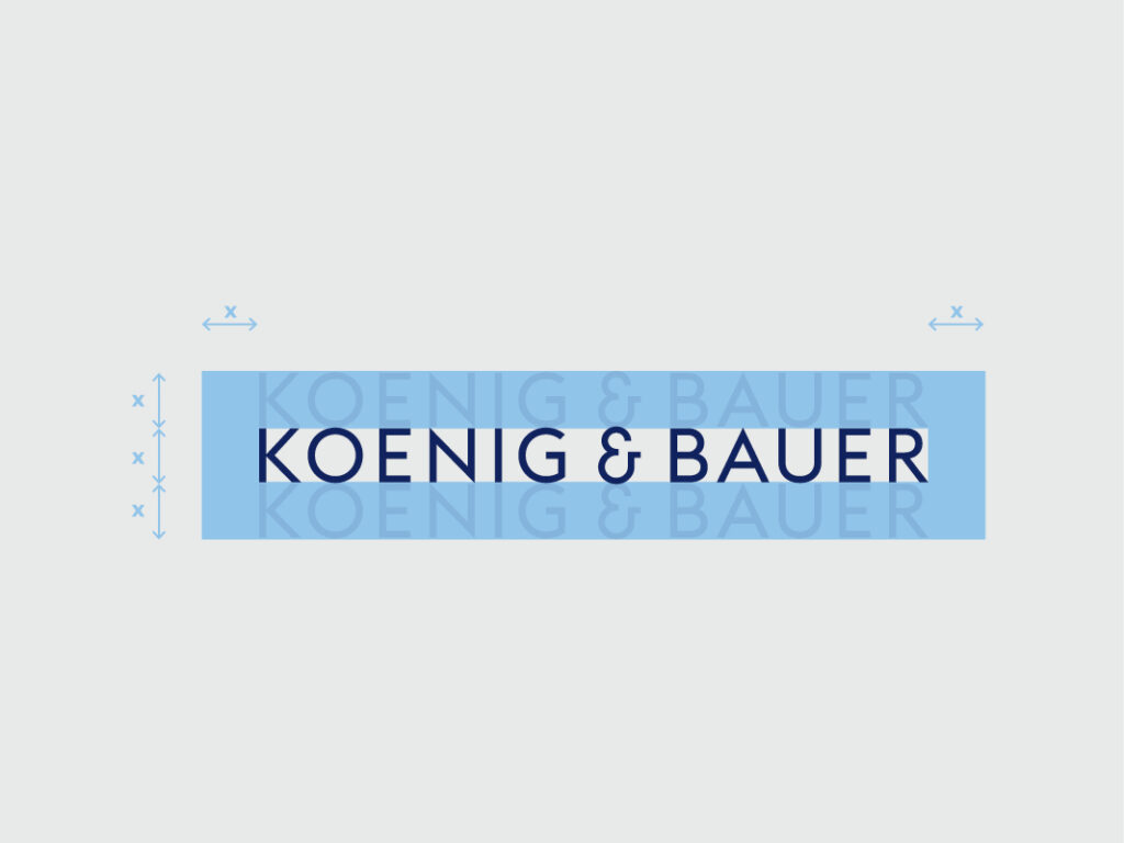
Minimal protected space
The protected area gives the Koenig & Bauer trademark sufficient space to make a good visual impact and achieve a high level of visability.
The distances for measuring the protected space are calculated in proportion to the height (x) of the trademark.
The minimal protected space equals the height (x) of the trademark.
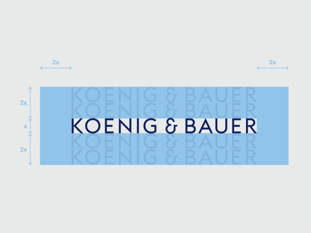
Optimal protected space
Although the minimal protected space around the trademark quals the height (x) of the trademark the optimal protected space around it equals the double height (2x).
Whenever possible the protected space of double height (2x) should be used.
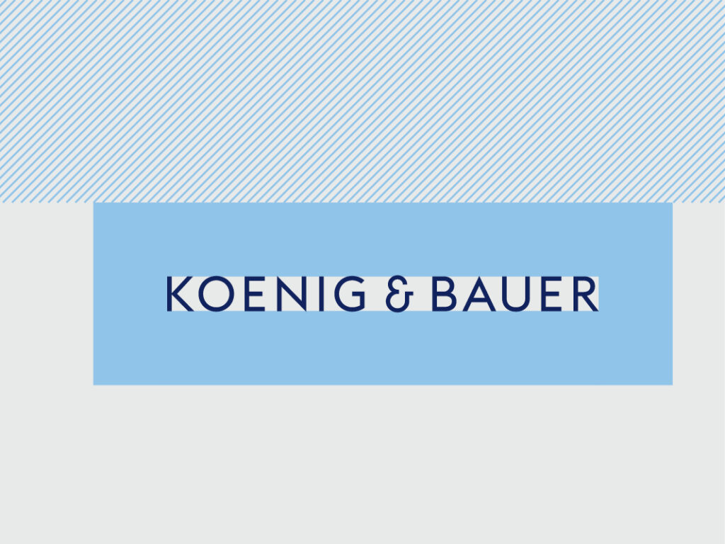
The logo is always on top
The Koenig & Bauer trademark must always be positioned uppermost. Texts, images, pictures, etc, are always posisioned beneath the wordmark – never above. This results in a striking signature. For more information, please see the chapter on the layout principle.
Important: In some cases, this rule dosen’t apply due to technical reasons e.g. the meta-menu on a website.
Application sizes print
The minimum width of the logo is 28mm.
As a rule of thumb, for formats with an aspect ratio of 5:7 (DIN series) and similar, the width of the logo is 1/3 of the shorter side.
Example: On a sheet fo A4 (210 x 297mm) the smaller dimension is 210mm. The logo’s width equals 1/3 of 210mm = 70mm.
Important: For other, more extreme aspect ratios, only the protective space around the logo must be observed
Application sizes digital
The trademark colors
Positive version Trademakr in the brand colour, Koenig & Bauer Blue. Used only on white background.
Negative version Trademark in white, for use against backgrounds in the brand colours and black.
Black/white version Trademark in black for use with black & white media.
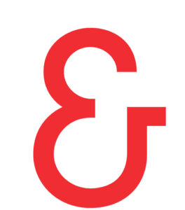
For the minimal display version, the “&” character (signet) from the trademark is used. Thanks to its self-contained and differentiated shape, the “&” character can be used as a signature for the Koenig & Bauer brand, for example as an app icon or badge. It can also be used as a design element in layouts.
A range of versions of the “&” character are available as files for various areas of application. Unlike the trademark, the “&” character is available in all primary colours.
Claim: "we’re on it."
The claim “we’re on it” is the communicative translation of our identity. It succinctly conveys the values and competencies of Koenig & Bauer to all target groups.
You can download the claim in a range of versions which are suitable for different purposes. It may only be used in the predefined versions and must never be altered.