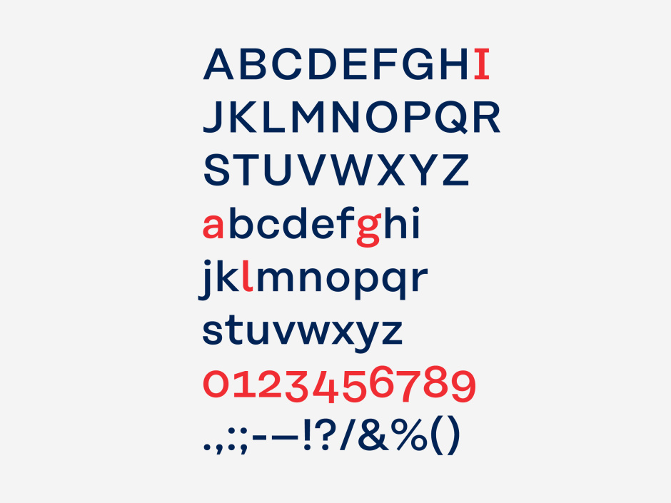
The Koenig & Bauer typeface ensures that information is conveyed legibly and comprehensibly across all media. The font combines geometric forms and engineering precision with friendly, humanistic shapes, creating a clear style statement for the entire brand presentation.
Koenig & Bauer typeface
Corporate typeface for headlines and body copy
The Koenig & Bauer typeface makes a clear style statement that impacts the entire presentation of the brand. The corporate typeface is based on the Rational font family, and is available in two different typesettings. The typeface combines geometric forms and engineering precision with friendly, humanistic shapes.
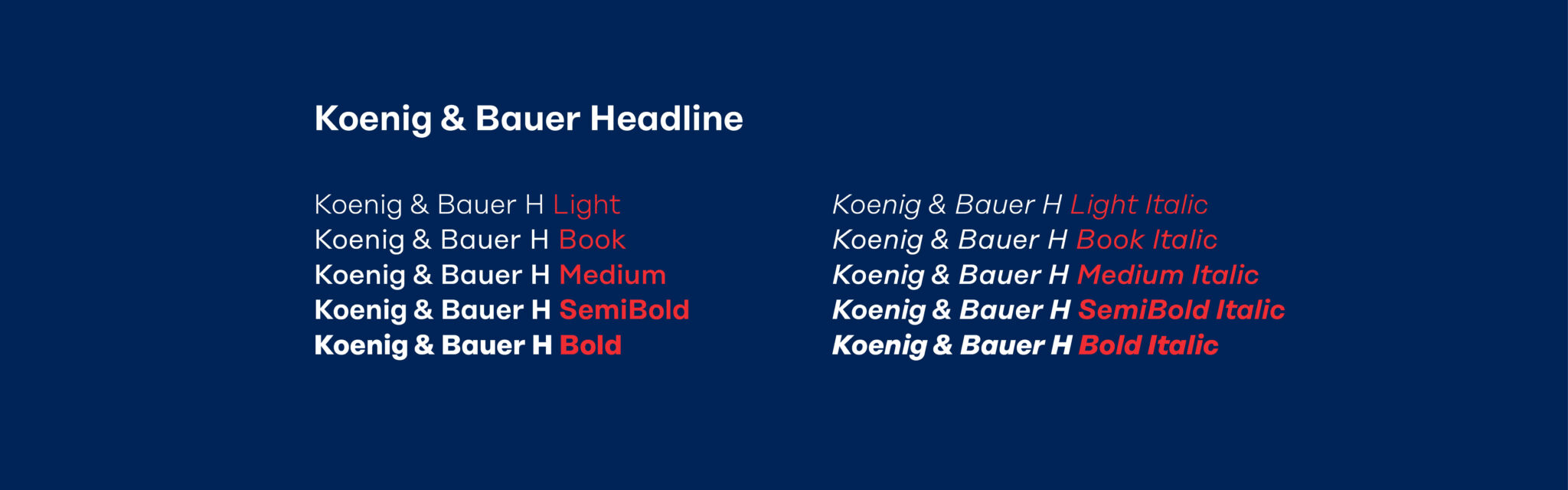
Koenig & Bauer Headline
The Koenig & Bauer H has been optimised for headlines and enables large-print script to make a bold statement.
Koenig & Bauer Text
The Koenig & Bauer T has been optimised for running text, and ensures better legibility in small-print areas.
Typefaces
The Koenig & Bauer typeface has been optimised for use in digital media and printed matter, and is used in a versatile manner in all types of communication. The data sets for the brand font are subdivided into three platform-specific folders:
OpenType (OTF) for Mac-based operating systems, the corporate typeface is available in an open type format with the file suffix .otf.
TrueType (TTF) for Windows-based operating systems, the corporate typeface is available in True Type format with the file suffix .ttf.
Web fonts (WEB) Additional web fonts are available for Internet and web-based applications.
Across all systems, Arial is used as a replacement font where the brand font is not available. Ideally, its use should be restricted to Office applications (e.g. MS Word and PowerPoint) and emails.
Headlines: Arial Bold Body copy: Arial Regular
Headline principle
The constant drive towards progress, change and ongoing development is visualised by the insertion of the second line in the headline.
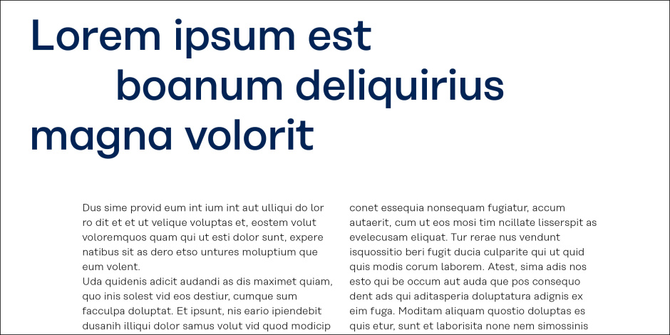
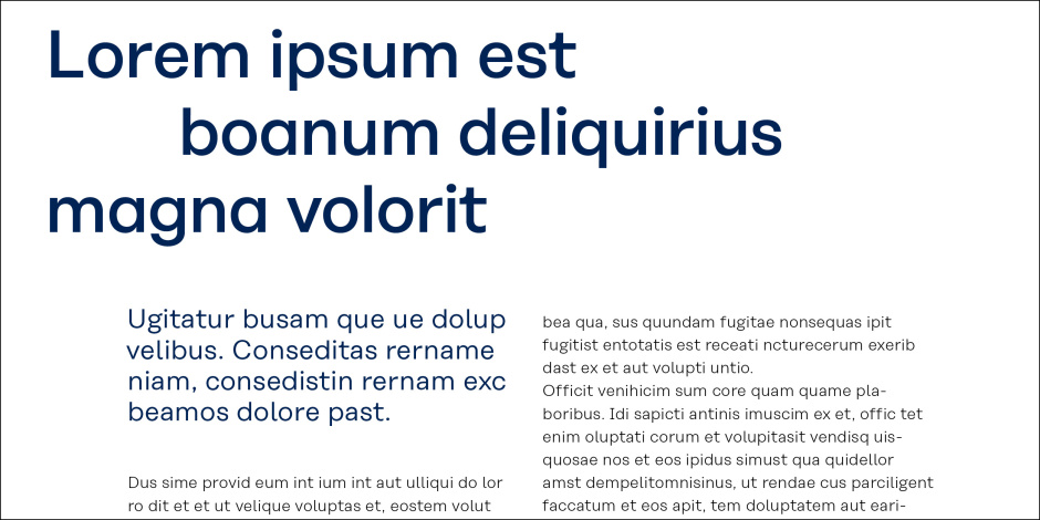
Headlines are always positioned as two-line or three-line headlines in Koenig & Bauer H Medium, and are aligned to the upper or lower edge of their text frame in the baseline grid. In principle, the size of the headline can be chosen freely, such that content is conveyed together with the brand elements in the best manner possible.
Headline structure
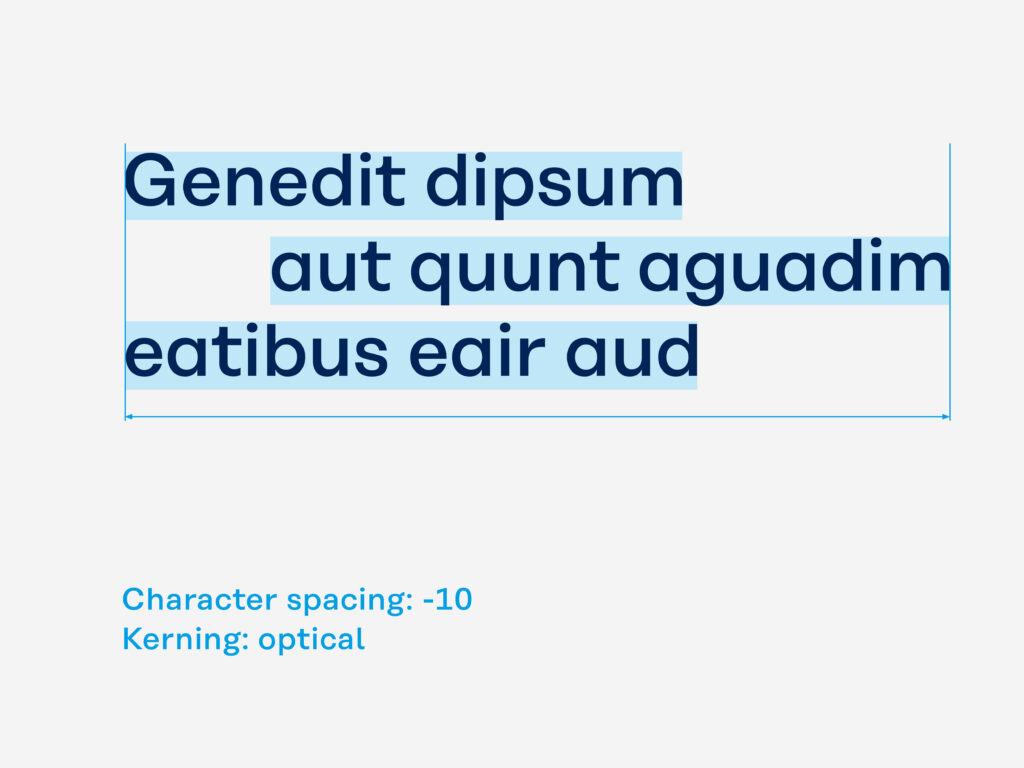
Headline
Koenig & Bauer H Medium Character spacing: -10 Kerning: optical
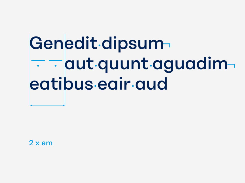
Insertion
The second line of a headline is always inserted after exactly two em spaces.
InDesign shortcuts: Mac: Cmd + Shift + M Windows Ctrl + Shift + M
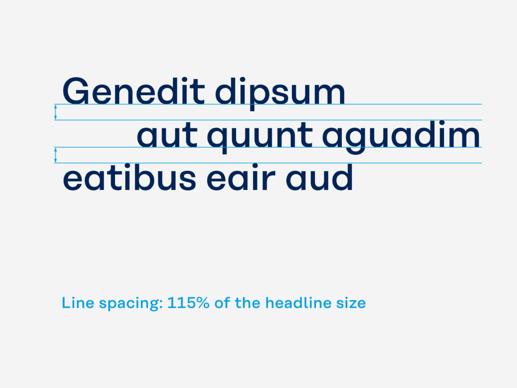
Line spacing
The line spacing of a headline is always 115% of the headline font size.
Example: Font size: 40pt Line spacing: 46pt (40 x 1.15 = 46)
Subheadline use
Instead of the headline, information can be inserted on a second level as a subheadline. Subheadlines are always set in Koenig & Bauer H Book. The guidelines for determining character and line spacing are identical to those for headlines.
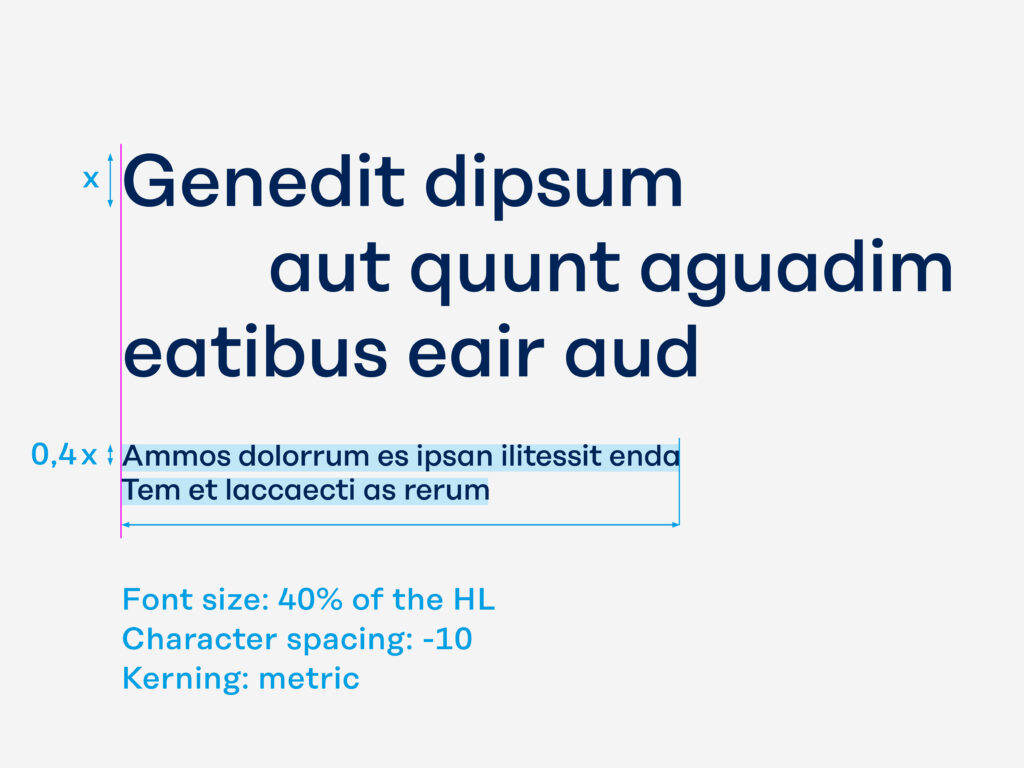
Subheadline structure
Subheadline
Koenig & Bauer H Book Font size: 40% of the HL Character spacing: -10 Kerning: metric
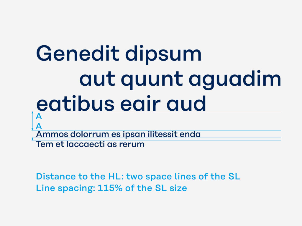
Distance to the Headline
The distance between the SL and the HL is two space lines of the subheadline. The line spacing of a subheadline is always 115% of the SL size.
Example: HL font size: 40 pt – SL font size: 16 (40 × 0.4 = 16) SL line spacing: 18.4 (16 × 1.15 = 18.4)
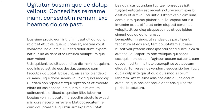
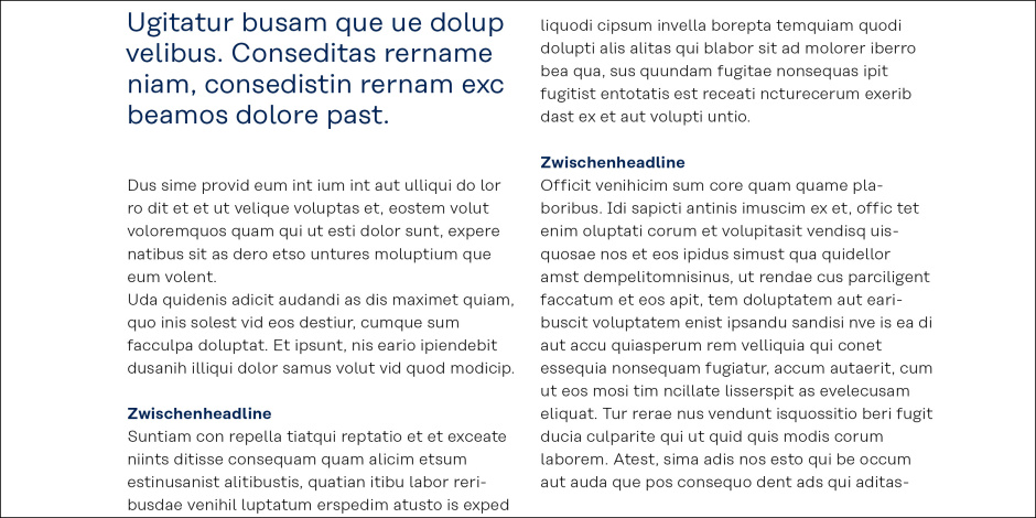
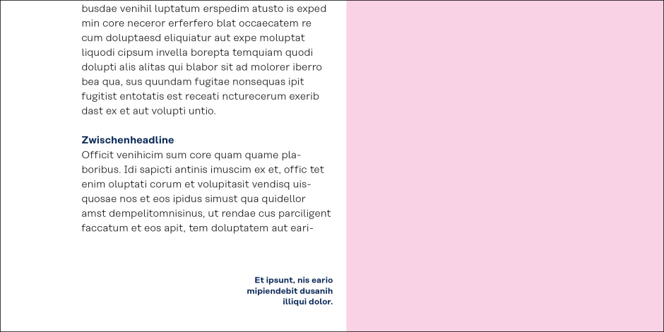
Font hierarchies for inside pages
Body copy is set in Koenig & Bauer T Light. Exact specifications have been defined and are also determined in the paragraph formats of the literarure templates. Thicker fonts are used for intermediate headlines, highlighted words and picture captions.
Headline/Lead Koenig & Bauer H Medium font size: 42 pt, 36 pt 30pt, 24 pt line spacing: 115% character spacing: -10 kerning: optical font colour: Koenig & Bauer Blue
Introductory text Koenig & Bauer T Book font size: 16.8 pt or 14.4 pt line spacing: 115%, character spacing: 0 kerning: metric font colour: Koenig & Bauer Blue
Body copy Koenig & Bauer T Light font size: 8.5 pt line spacing: 12.25 pt character spacing: +15 kerning: metric font colour: Black
Intermediate headlines Koenig & Bauer T SemiBold font size: 8.5 pt line spacing: 12.25 pt character spacing: +15 kerning: metric font colour: Koenig & Bauer Blue
Captions Koenig & Bauer T SemiBold font size: 7 pt line spacing: 9 pt character spacing: +15 kerning: metric font colour: Koenig & Bauer Blue