Icons are pictorial symbols for a word or phrase- clear and easy to learn. Their strongly stylized representation facilitates and accelerates their perception and thus the communication of information. By simplifying the elements learned, they communicate without barriers and without additional descriptions, recommendations for action or application hints, regardless of cultural background.
The icons are an important part of Koenig & Bauer’s corporate design. The icon set for various applications defines fixed symbols that are used consistently on all channels and our machines.
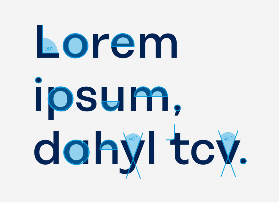
The Koenig & Bauer typeface as basis of icon stylistics
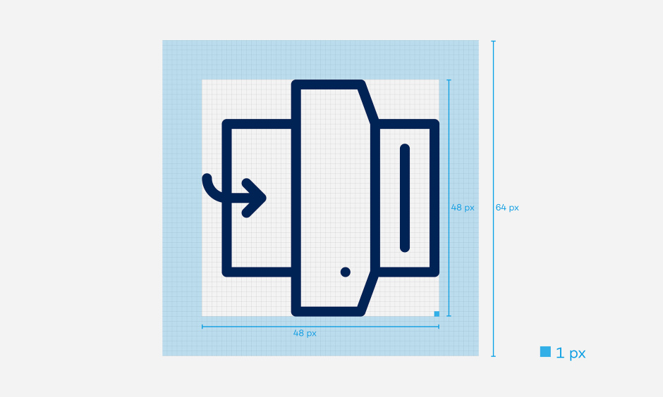
The Koenig & Bauer icon style is characterised by the brand typeface. From it, geometric shapes, angles and curves were derived that turn icons into Koenig & Bauer icons. This creates identity and points the way for the creation of all other icons.
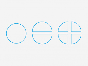
Geometric Shapes
The Koenig & Bauer brand font is based on geometric shapes and combines corners with curves.
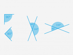
Angles
The 40° angle (of y and v) and the right angle stand in exciting contrast to the round elements.
Curves
Concise curves are translated into contours with rounded ends.
Structure of Icons
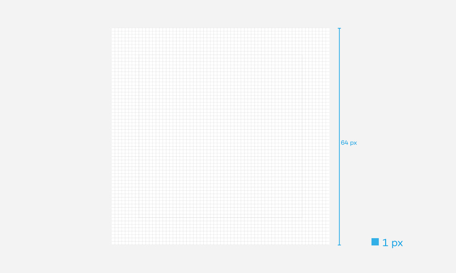
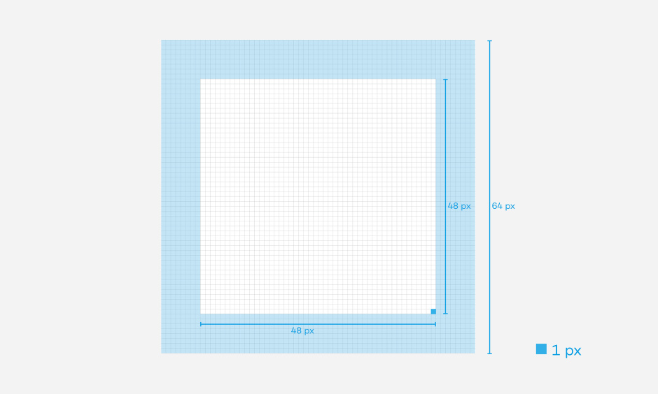
The basis of a icon is a pixel-based basic layout grid. The footprint is 64 x 64 pixels. The grid is available for download.
The surrounding protected space is 8 pixels. This results in a design area of 48 x 48 pixels.
The line weight of Koenig & Bauer icons is 2 pixels. Icons are designed exclusively in lines. Full-solid icons do not correspond to Koenig & Bauer's corporate design.
1. Typical corporate design language elements through the use of 40° + 140° angles 2. as well as 90° angles 3. Incorporation of roundings from typography
Monochrome: Koenig & Bauer blue
Simple colouring of icon in Koenig & Bauer blue
Two-colour:r blue and red
Two-tone colouring of icon in Koenig & Bauer blue and red
Monochrome: Negative
White icon for use on dark substrates
Minimum sizes when using icons
For digital applications, the guide value is 32 x 32 pixels. For print applications, the PDF file must not be smaller than 50% of original size.
Naming and file formats
When exporting and saving new icons, there are clear rules to ensure that icons are logically named in the long term. Packages for print and screen are saved. The following English file and naming rules apply: