Imagery

For brand management, visual language plays a key role in presentation. Images convey ideas swiftly, comprehensibly and without language. The image concept combines three image contents: people, machines and ideas.

Image content in the Koenig & Bauer world

Images are used to visually convey the values of Koenig & Bauer. People images centre around employees and show their passion for the trade. Machine images present lavishly orchestrated printing machines, richly detailed close-ups and glimpses into production. Materials and printed fabrics, developed by Koenig & Bauer together with customers, provide content for Ideas” images.

People

Focus on Hands

The focus on hands shows hands-on action and dedication in a direct manner. Details are in the foreground, and observers find themselves drawn into the action. The pictures have an approachable, personal touch.

Focused view on action

The situations supply authentic glimpses into the work environments of people who are deeply focused on their work, whether servicing a machine or sitting in a board meeting. The visual language has a documentary style. For example, people do not look straight into the camera, but engage fully with their work.

Portraits

The entire spectrum of portrait photography can be deployed, from small pictures in which the surroundings dominate, to close-ups of people. But the focus is always clearly on the person. The people in the images take a clear stance; their emotions and gestures are authentic. This makes the people come across as natural and approachable.

People in their natural environments

The situations supply authentic glimpses into the work environments of people who are deeply focused on their work, whether servicing a machine or sitting in a board meeting. The visual language has a documentary style. For example, people do not look straight into the camera, but engage fully with their work.

Machines

Staging the product

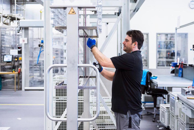
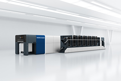
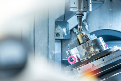
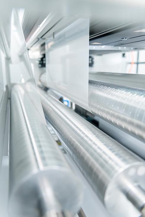
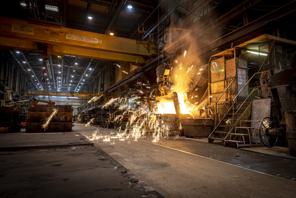
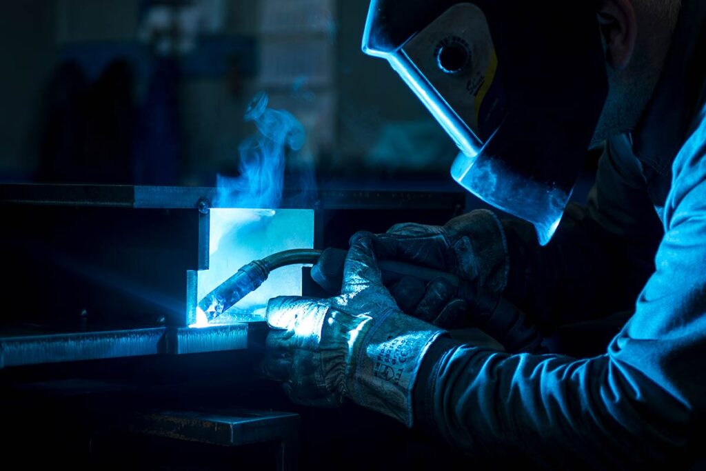
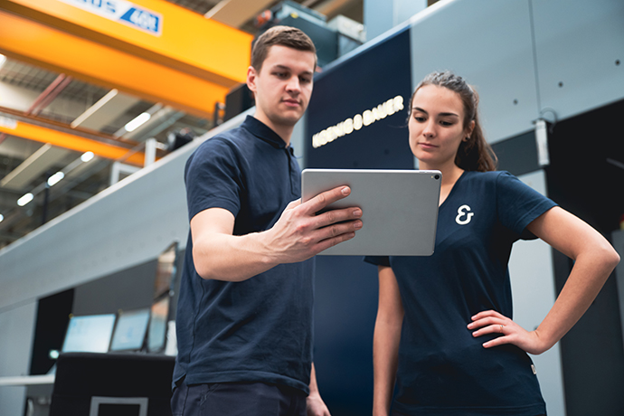
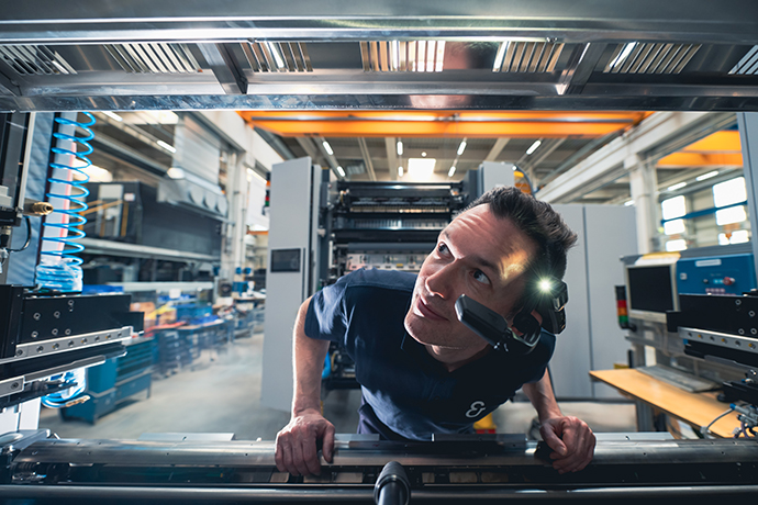
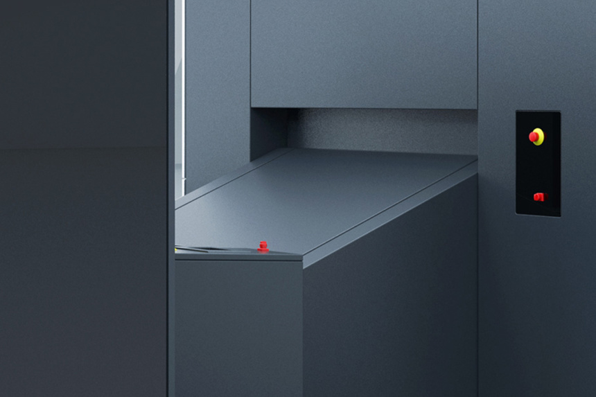
The brand value “passion for mechanical engineering” is visualised through “machine” images. The high-quality and lavish orchestration of products conveys true passion for innovation and state-of-the-art technology. Bright lighting puts the spotlight on the machines. The light sets the stage for the materials and product designs.

The spatial environment of the cutting-edge corporate showroom picks up on the product design of the machines and was developed especially for this purpose. There is a perfect balance between product presentation and minimalised industrial characteristics. 

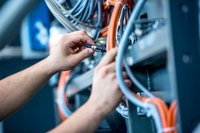
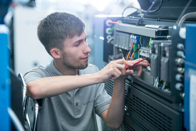
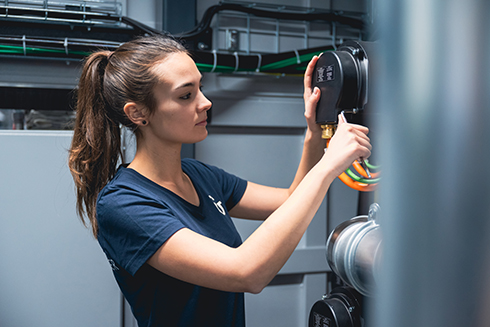
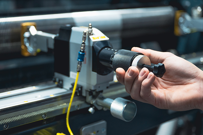
Close-ups of particular machine parts or functions complement the overall picture and offer more detailed glimpses into the product portfolio. More information on setting the stage for machine imagery can be found further down this page.

A glimpse into production

The whole spectrum can be deployed, from images of entire production halls to close-ups of materials. Images should have a minimalist, documentary feel.

Ideas

Image style

The style of imagery is defined by specific criteria which pictures need to meet, e.g. with regard to composition, contrast and directed lighting. These give formal expression to the brand values. At the same time, a consistent image style ensures that pictures can be clearly assigned to Koenig & Bauer.

Formal composition

In focus and at the heart of every picture is the core message, supported by stylistic means. 

Picture compositions are calm and orderly. The surroundings and backgrounds are restrained and reduced to a minimum. Natural, bright lighting sets the stage for people, machines and materials and thus increases their impact.

Blue, grey, red and white – the corporate brand colours – subtly infiltrate the backgrounds, clothing and machines in the picture compositions.

Angle and perspective

In Koenig & Bauer imagery, photographs and portraits of people are taken at eye-level.

In order to show all the dimensions of printing machines, a slight side angle is used for product presentation.

The natural and realistic imagery can be enhanced by exciting and unusual perspectives.

Colours, lighting and contrast

The colours in the pictures are slightly muted, but nonetheless warm, friendly and natural. The lighting creates a balanced, bright and clear atmosphere. The lighting penetrates the entire depth of the pictures so that details are clearly identifiable. Clear and precise contours of light enhance technical details and the focus on people, machines and materials.

The brand colours – blue, grey, red and white – subtly infiltrate the backgrounds, machines and clothing in the pictures, and are post-edited to replicate the brand colours as exactly as possible. Distracting colours will be reduced in post-production.

Focus

People, machines and materials are always shown in focus. This sets them apart from the blurred back- and foregrounds. The usage of a shallow depth of field is allowed as long it is supporting the character of the picture.

Image use

The way images are deployed in the various levels of media is clearly defined so that pictures can unfold their full potential and communicate their message as clearly as possible. This ensures that imagery contributes to a consistent brand identity across all media.

The use of images in titles and on higher levels

In titles and on higher levels, e.g. home pages and lead pages on the Internet, intriguing details and close-ups are used. “People” images focus on hands, “machines” show close-ups of printing machines and “ideas” deploy abstract close-ups of materials.

Using pictures on inside pages and subpages

On inside pages and lower levels, long shots and large-scale picture content is preferred. “People” images show people whose attention is focused fully on their work and people in their environment. “Machines” show printing machines from all angles, and “ideas” images deploy puristic photographs of materials.